Starter Sites
Luna
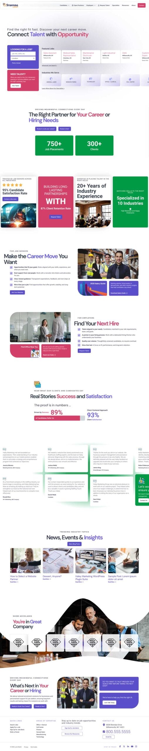
Luna is a modern, interaction-focused website starter built to drive clicks through visual hierarchy, scroll-based engagement, and concise messaging. Dynamic headers, stat-driven content blocks, and layered social proof guide users naturally toward key calls-to-action, creating a clean, eye-scannable experience ideal for staffing and service-driven brands.
Highlights
- Masonry-inspired interface with strong visual structure
- Scroll-driven engagement and expanding typography
- Infographic-style stats and social proof sections
- Horizontal scrolling for testimonials and key metrics
- Mini CTA widgets placed throughout the user journey
Juniper
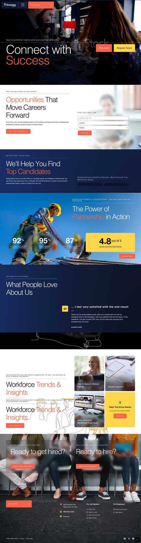
Juniper embraces confident minimalism and visual precision — a modern, full-width design that blends strong branding with clean, human-centered usability. Built around clarity, whitespace, and effortless navigation, every element is intentionally placed to guide attention and drive action without unnecessary distraction. Bold typography, subtle sublines, and dual call-to-action flows create an experience that feels premium, focused, and approachable. Perfect for staffing and professional brands that rely on visual identity, storytelling, and a refined first impression.
Highlights
- Approachable, contemporary tone that feels premium without being corporate
- Full-screen, full-width visual layout designed for strong brand storytelling
- Dual-column sliding content system with anchored left panel and dynamic scrolling right panel
- Subtle blur-layer transitions creating depth and see-through visual dynamics
- Unique top navigation structure replacing traditional starter layouts
- Hybrid visual language combining full-screen photography with soft, hand-drawn graphic accents
- Adjustable footer background imagery for extended brand expression
- Designed to double engagement through parallel CTAs across the two-column layout
Please note: full-screen video assets are not included and may require additional licensing or production.
Austera
Austera embodies sophistication and rarity — a modern, SaaS-inspired design that blends elegance with subtle mystery. Each element is designed to enhance clarity, focus, and conversion — from animated headers that immediately draw the eye to background movements that create a subtle sense of life and flow without distraction. Perfect for high-end, premium, or creative brands seeking a distinctive, modern web presence.
Highlights
- Unique, refined, and slightly mysterious tone conveying sophistication and exclusivity
- Modern SaaS-style interface with airy spacing and clean, balanced layouts
- Animated headers and smooth scrolling effects that reinforce key messaging
- Crafted to attract both human users and intelligent crawlers through optimized design and structure
- Additional “Quick Contact (Leave a Note)” module integrated in the Hero section for instant user interaction
Please note video is not included and is an additional cost.
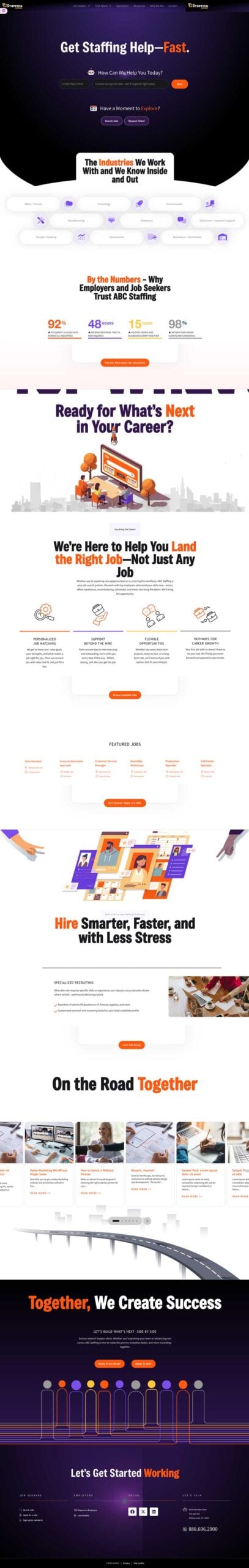
Diamond

Diamond is a modern, sleek dark-theme design inspired by the best practices in web development and aimed at transforming your website visitors into valuable business opportunities. Each page is thoughtfully crafted for optimal usability and conversion.
Highlights
- Elegant design ensuring a smooth and intuitive user experience.
- Modular yet expansive layout
- Strategically placed elements to boost visitor engagement and conversion.
- Designed for quick user interaction and improved engagement without overwhelming the visitor.
- Dynamic color transitions to maximize the user’s focus and experience
Please note video is not included and is an additional cost.
Rose

Rose, inspired by SaaS websites, is designed to not only tell your brand story, but convert visitors to business opportunities. Every page carefully created for usability and conversion.
Highlights
- Compact design with excellent vertical and horizontal flow.
- “App-like” modular design, yet open and airy.
- Focus on conversion-rate optimized (CRO) elements to help convert visitors to business.
- Short banner and banner-less design (no full screen banners) for quicker user interaction.
- Color coded pages for employers and job seekers.
- Light and dark mode in one design.
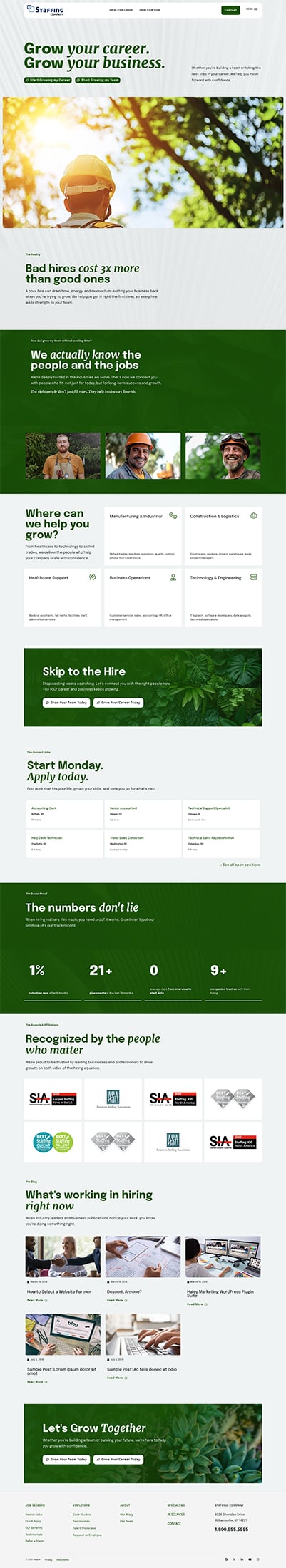
Bonanza

Bonanza leverages YOUR staffing firm’s brand. Bold use of your brand colors and fonts will allow your staffing company to stand out. Fully ADA-compliant with Conversion Rate Optimization in mind, this starter site will not only allow you to stand out, but convert more visitors into true opportunities!
Highlights
- Colorful and bold fonts to grab attention and allow important information stand out.
- Bright and captivating images and/or graphics–customized to fit what’s best for your brand!
- Menus and calls-to-action designed to enhance the user experience.
- Smaller subpage headers to make content more accessible.
- Simple search for candidates and quick action button for clients right on the homepage.
- Great for office, information technology and healthcare staffing companies.
Twin

Streamlined CRO (Conversion-Rate Optimization) centered website design prioritizes conversion paths for candidates and prospects alike. Twin harnesses the power of CRO best practices to captivate your audience, encouraging increased sales and applications. Deliberate design has been employed on every page, strategically aimed at transforming your prospects into valuable candidates and clients.
Highlights
- Get WOW’d by Twin: Experience the jaw-dropping features and stunning visuals that make Twin a game-changer for our websites.
- Customize it Your Way: From colors to layouts, Twin lets us tailor our websites to match our client’s brand personality and stand out from the crowd.
- Work Smarter, Not Harder: Learn how Twin’s user-friendly design will boost CRO.
Goode

Our first fully Conversion Rate Optimization (CRO) focused website design! Goode pulls principles from CRO best practices to hook your audience into your website to drive sales and applications. Every page has been carefully thought through and designed to convert your prospects into candidates and clients.
Highlights
- CRO Optimized.
- Integrated CTAs for Job Seekers and Employers.
- Feature social proof through testimonials, logo carousels and animated stats.
- Descriptive navigation to drive visitors to jobs or services.
- Quick job search and job feeds for candidates.
Vesper
Vesper puts your clients and candidates goals front and center. This no frills design focuses on helping users quickly and efficiently apply to jobs or hire talent. It integrates seamlessly with Haley Marketing WordPress plugins and tools.
Highlights
- Simple, straight forward design.
- Featured jobs feed with quick link to browse jobs.
- Specialties sections across the site link directly to the job board filtered to the corresponding category.
- Integrated CTAs for Quick Apply and Request Talent.
- Job Seeker and Employer testimonials throughout the site.
- Feeds to your marketing content for prospects not quite ready to commit or apply.
Logan

A new, modern starter concept that maximizes a more natural design style and leverages your brand. It makes use of type, imagery and graphic elements to create a unique and thoughtful experience for your job seekers and employers.
Highlights
- Large Format Pop-Up Menu
- Sticky Search Jobs for Your Candidate Pages (easily turned on for the homepage)
- Lots of CTAs & Sticky CTAs
- Your Social Media Presence at the Fore-Front of the Contact Page
- Easily Matched to Your Brand
Gardner

This concept focuses primarily on two main audience groups on the homepage. The user can hover over the left or right to see more information. The full screen design allows there to be a wide variety of content that can displayed on hover. In this design, the content and branding colors have more focus than the imagery.
Highlights
- Full screen design with interactive hover/slide feature
- Primary focus on two main audiences that can also be used for two divisions
- Flexible content area in the hero unit on hover
- Wide screen, full page subpages with a flexible sidebar and callout area
- Subpage layout with focus on bold text headlines rather than imagery
- CRO Optimized
Mazama

This starter focuses on a tall website structure with full-width content on the homepage, strong visual elements, and brand color. It showcases services areas on the homepage, as well as differentiator flip cards on the job seeker and employer pages. The site employs a variety of CTA areas to encourage users to take action.
Highlights
- Tall homepage with full-width widget areas
- Homepage services area
- Differentiator flip cards on job seeker and employer pages
- Full-width testimonial areas
- Footer CTA bar
Eldorado
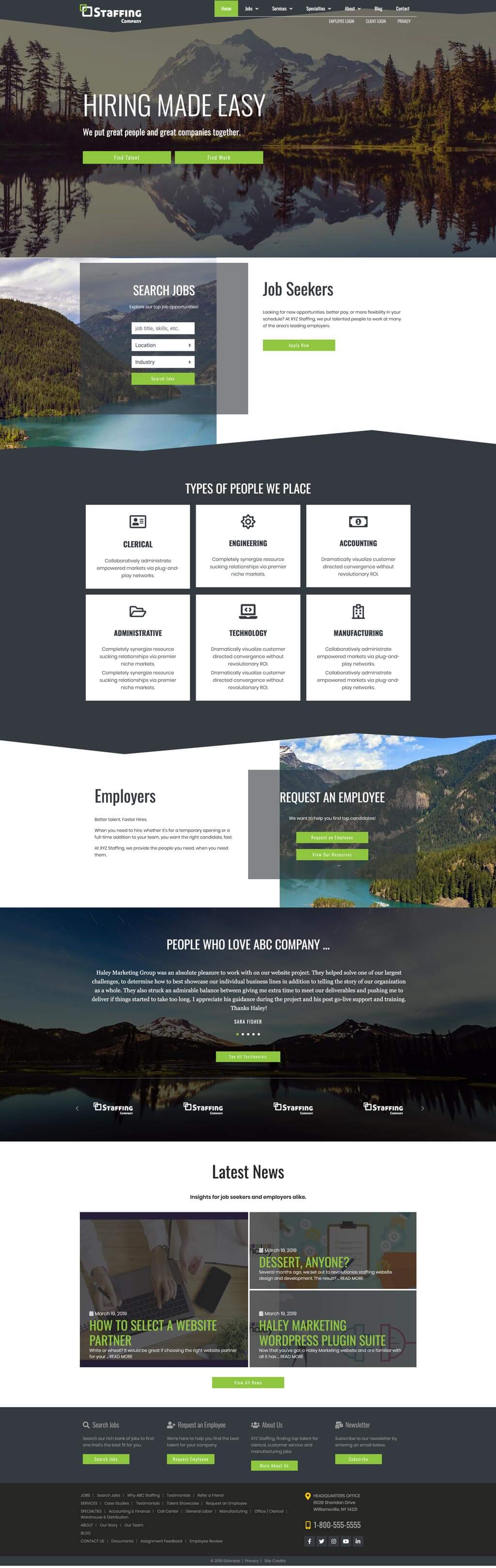
This concept focuses on helping users quickly and efficiently find the information they’re looking for. In this concept, the content and users take precedent over imagery. The design features long pages, plenty of space for calls-to-action and minimal imagery.
Highlights
- Full screen design with two main sections on the homepage
- Call-Out Boxes for immediate access to information
- Flexible content areas to feature content on homepage
- Calls-to-Action in the Footer
- Wide screen, full page subpages with flexible content areas
- Long, single-column subpage layout
Shasta

This concept features three main, animated calls to action on the homepage. Flexible content areas allow for a wide variety of content that could be displayed. The design uses strong imagery to support the content.
Highlights
- Homepage features animated calls to action
- Flexible content areas on homepage
- Social Media icons in homepage hero section
- Subpage layout with several versatile content areas
- Large call to action buttons on mobile
Lassen

Simple and clean starter focused on color and text. Images are meant to be used within background only, preferably out of focus, with a texture, or black and white as shown. Best used by companies with bolder branding.
Highlights
- Full width website
- Responsive
- Long, scrolling homepage. Sections can be reordered
- Full width sidebar widgets are placed beneath copy to create long, scrolling subpages
- Perfect for emphasizing stand out copy, small icons, and color
Glacier

A tall and expandable home page gives those looking at the website a quick overview of the company without overwhelming them with too much information. The page’s various elements all have plenty of room to breathe to maintain readability. Large background images in clearly delineated sections provide context without taking attention away from the important stuff. Splashes of color create a natural visual hierarchy and make it easy for visitors to see where to go next.
Highlights
- Configurable homepage tiles: both static and dynamic widgets available
- Responsive layout maintains readability on smaller screens
- Icons fly in with clean animations when the user scrolls to that part of the page
- Optional large background images in multiple sections
Rainier

Parallax scrolling on the homepage of this site provides a dramatic introduction to your services and the interior pages on the site. The homepage features two layers of navigation: top navigation to each of the subpages; and navigation within each of the homepage sections.
Highlights
- Long, scrolling “intro” homepage with flexible content sections
- Sections can be re-ordered to fit site goals
- Parallax scrolling effect
- Multiple sub-page layouts with widget sidebar areas (left sidebar, right sidebar, full width page)
- With bold images and minimal home page copy, this site is perfect for showing off your firm’s personality
Notes
Homepage sections are not meant to be highly interactive or hold a lot of content. They are more of a section “introduction”, with a single call to action that would go to a subpage.